Client
Outward Bound Australia is an independent not-for-profit educational organisation that helps people discover, develop and achieve their potential.
Brief
-
Concept project.
-
To redesign outwardbound.org.au website to have a smooth and seamless enrolling in their programs and to provide easy process flow to donate.

MY ROLE
User Experience Designer,
User Interaction Designer, Storytelling,
Presenting

SKILLS
Interviews & Surveys, Research Synthesis, Personas, Rapid Wireframing, Prototyping, Usability Testing, Design Iterations

TOOLS
Axure, Optimal Sort, Lucidchart, Keynote, Pen, Paper
Overview
A quick overview of the techniques used in design journey
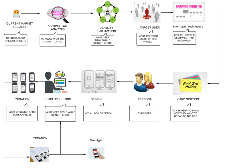
Learn
-
Learn about current website
-
Contacted outward bound Australia
-
Found the competitors and analysed their site
-
Found some users and tested with the current website
-
Synthesised the findings.
Build
Measure
-
Affinity mapping
-
Empathy mapping
-
Found target audiance.
-
MOSCOW scale
-
First ideation
-
User testing
-
Stakeholder testing
-
Review feedback
"How do you feel when browsing the site?"
-
There is no clear insight about the programs
-
There is so many info required before getting registered.
-
Most of the information is repeated, but couldn’t find what I want
-
Making the donation is difficult
-
Often I am not sure which page I am in
Browse through and find their contact details
Difficult to find what programs they offer
User Inerview
Interviewed with business and understood the business objectives.
Business user

1
Program names should remain the same
Maximise the chance to capture customer contact details
Augment customer satisfaction and reduce churn
Branding shouldn't be changed
Attract to raise funds
All programs should be clear and easy to understand
8
Website users
"What is your opinion on this site?"
The programs are not very clear to understand
The purpose/mission of the site is not very clear.
Lot of information in the menu
Login button is not very clear
Enrolling to a program is not clear
Need sufficient information to justify the fees
"Why do you visit this site? "
I would like to donate.
To find what group activities are available.
I would like to enrol in a program
To find adventure program for my holidays
"How do you feel when browsing the site?"
There is no clear insight about the programs
There is so many info required before getting registered.
Most of the information is repeated, but couldn’t find what I want
Making the donation is difficult
Often I am not sure which page I am in
To get more insights about the programs their benefits
My target
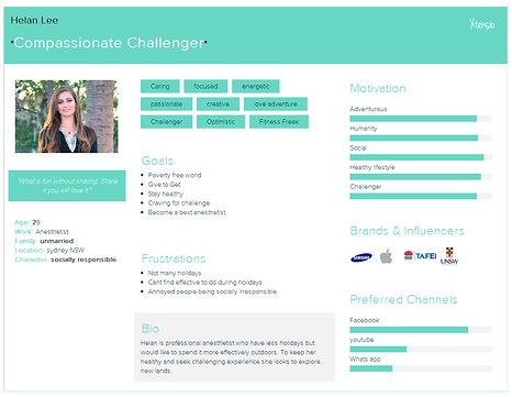
After collating the findings from the interview was then able to get a clearer picture of who is the target users.
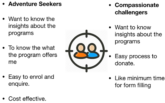
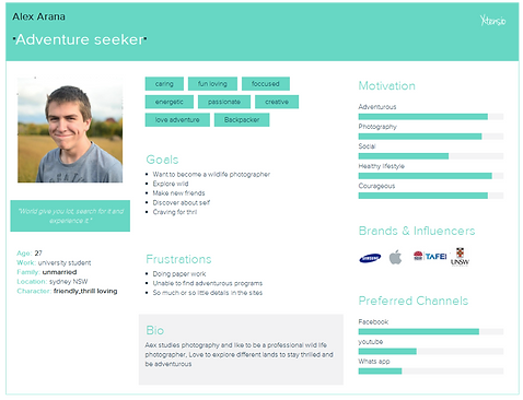
Personas
I designed the personas which allowed me to vet and prioritise the feature requests

Competitive Analysis
-
I compared key competitors and analysed the features of each provider.
-
Key competitors were
-
Australian outdoor education
-
Outback initiatives
-
-
Key findings from competitor analysis
-
All competitors focus only on certain category of people (school goers, corporates)
-
Very limited programs.
-
Couldn’t have good insights about the programs
-
Vision is not very clear.
-

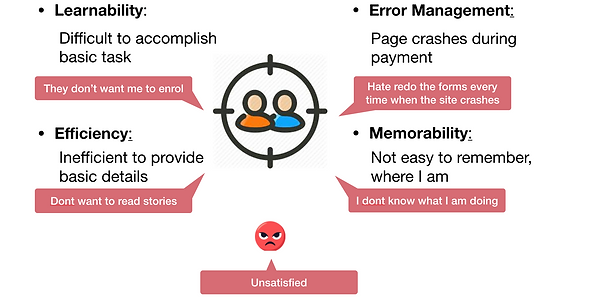
Usability Evaluation of current site
Evaluated feasibility for the current site to understand the users
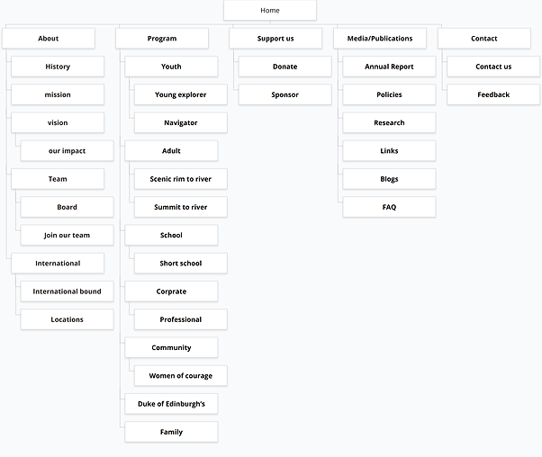
Information Architecture
From research insights, empathy mapping and user flows I created a sitemap which emphasises the features of the app. I categorised and classified the information based on user’s needs and objective.
We did card sorting to find the following
Card Sorting
Conducted card sorting to understand the user point of view where it proved my Information Architecture was right


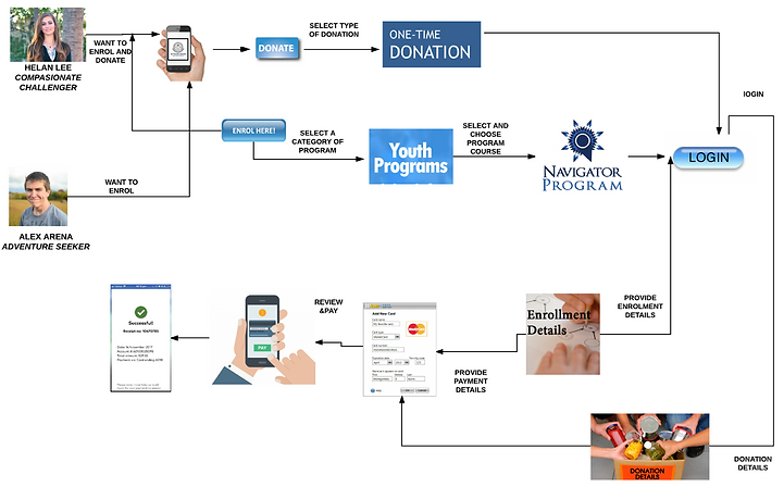
Userflow
I then sketched out the flow that user would take to complete the task.
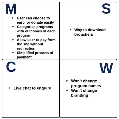
Minimum Viable Product (MVP)
-
From user interview insights and affinity mapping, I dive down to the features of the app using MoSCoW method and prioritising them.
-
I stepped into building out minimum features which focus on user needs and business objectives.
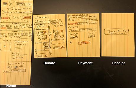
Digital studio & Paper prototype
-
After brainstorming some ideas I started to sketch the designs and tested with 8 users.
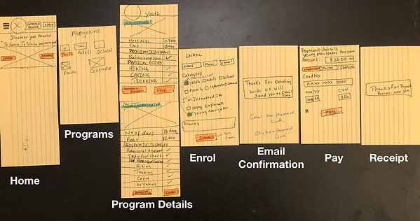
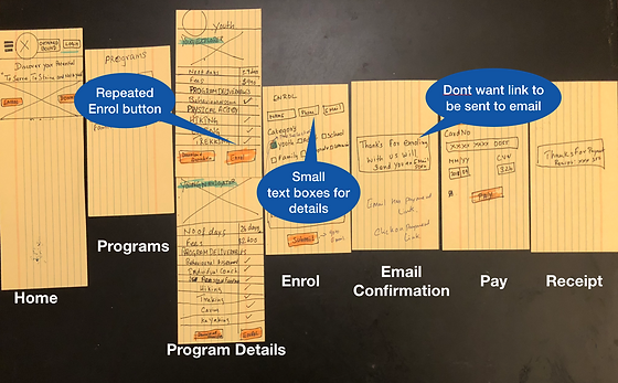
Paper prototype feedback
-
After the testing conducted with paper prototype, I got the following feedback
-
Repeated enrol button
-
Small text boxes for details
-
Don't want link to be sent to email
-
Digital prototyping & Usability Testing
-
I then created an interactive prototype in reference to paper prototype and conducted next iteration, usability testing.
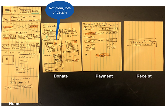
Screen1

Screen1 - Feedback

Screen1 - Feedback continued

Screen2
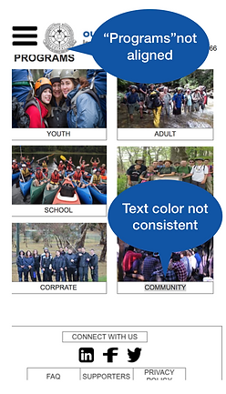
Screen2 - Feedback
Final prototype and usability testing
-
Final prototype and usability testing conducted with 7 users with following tasks
-
Look the site and say aloud what is your opinion.
-
You are youth willing to enrol for a program.
-
Understand program insights.
-
Enrol to youth navigator course.
-
Make a payment for the course.
-
What type of donation you want to make
-
Pay for the donation

Summary
-
We refined the prototype after feedback from usability testing.
-
This MVP site is a mobile-first solution designed for Outward Bound Australia.
-
This app provides the user with a convenient and reliable way to enrol or donate through the site.
-
Knowledge Gained: importance of client relationship, Providing Statement of work, work using agile methodology,
-
Challenges faced: Client Unavailability, Organising users, Working under the limited time frame, an end to end design.
Next Steps
-
There is no end for desire, so there is always room for improvement.
-
Design desktop version
-
Design a mobile app
-
User wants more ways to enquire (e.g, live chat)
-
Push notifications regarding the latest programs and seat availability
-
More user research and satisfy business user needs
-
And much more to come in future, stay tuned ….
MY WORK

Provide ED staff with a convenient and reliable way to record the ED patients pain level at regular intervals with reminders and store the information for medical staff to review and access.

Design a website for a driving school to help students to check availability and book classes from the site

A platform where parents can check on any updates about the child, as they are posted /logged by childcare staff !

Redesigned the website and addressed the requirements of users to revive and minimize the customer churn rate.