Client
Take Heart Australia is an organisation with a mission to dramatically increase the survival rate of Australians who suffer a sudden cardiac arrest.
BRIEF
-
South Western Sydney Emergency Research Institute (SWERI), is investigating the amount of pain experienced by emergency And trauma patients, both adults, and children, who attend their Emergency Department (ED).
-
There are quantitative tools to measure pain, but the main problem is that the health professionals, are very poor at getting people to tell them, mostly because of time.
-
They would like to find out how they can better serve patients and health professional to express or identify the burden of pain they suffer.


My Role
Interviews & Research, Data Analysis, UI Design

SKILLS
Interviews & Surveys, Research Synthesis, Personas, Rapid Wireframing, Prototyping, Usability Testing, Design Iterations

TOOLS
Paper & Pencil, Sketch, InVision, Google Forms
User Interviews
As a UXconsultant, I wanted to understand the current thought and process of medical staff and patients who are in the emergency department.
I visited the emergency department of the different hospital and interviewed the patients and medical staff there to understand their pain points.

25
Patients
Descriptions were elaborate and very subjective.
Not sure how to score their pain
Unable to understand the language the description is written.
Unable to understand the terminology
Were not asked their pain score
Long waiting time. Not sure what is happening
17
Medical Staff
want to know a patients pain trend
The ED become overwhelmed by new admissions
Some patients have drug-seeking behaviour
Want to know what impacts the pain
Some patients exaggerate pain scores
Lack of time to review the patient (e.g after giving analgesic)
Future reference
Survey
-
We then decided to put out a survey to validate some of the patterns identified through our interviews.
-
Received 29 responses
Insights from survey
What made you go into emergency?
20
-
Came to ED with Severe pain
Have you ever done a pain scale to rate your pain?
22
-
Have used pain scale to describe their pain
How well were you able describe your pain?
5
-
Can describe
8
-
Cant understand the pain scale
9
-
Were not able to describe their pain exactly
Card sorting
-
I decided to put out a survey to validate some of the patterns identified through our interviews.
-
Received 29 responses
Empathy Mapping
-
From the survey results and interviews, I gained insights about users and their behaviour.
-
This was used to create personas and understand their thoughts, needs, feelings and actions better.
-
At the end of this activity, we had some great ideas and discussed the patterns and outliers.
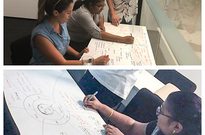

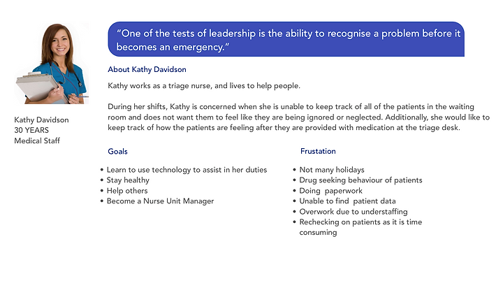
Personas & User Journey
-
From empathy mapping, I designed the personas which allowed us to vet and prioritise the feature requests. We then sketched out the journey that user would take to complete the task.


Minimum Viable Product (MVP)
-
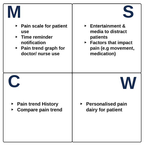
From user interview insights and affinity mapping, we dive down to the features of the app using MoSCoW method and prioritising them.
-
As a team, we stepped into building out minimum features which focus on user needs and business objectives.
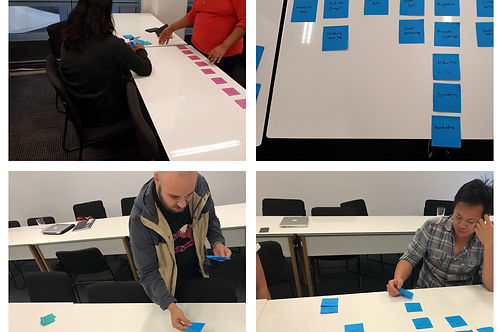
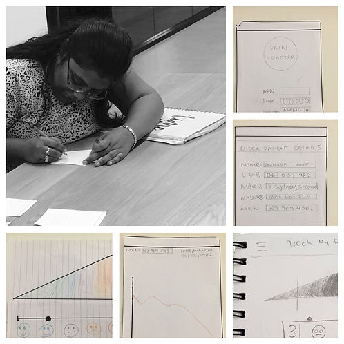
Design studio & Paper Prototype
-
We had collaborative design sessions where each one of us sketched, pitched our ideas and ideated the process.
-
This allowed us to share our ideas, understand various perspectives and insights, which eventually helped us to sketch low-fi diagrams.
-
I aimed to provide ED staff with a convenient and reliable way to record the ED patients pain level at regular intervals with reminders and store the information for medical staff to review and access.
-
I tested the paper prototype with nine users for early feedback. Users found the process to be beneficial.
-
They also gave some feedback with minor tweaks.
-
Which ensured us we were working in the right direction
Feedback
-
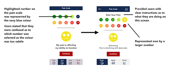
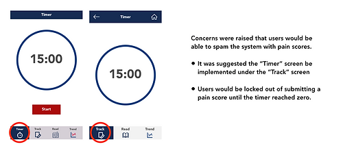
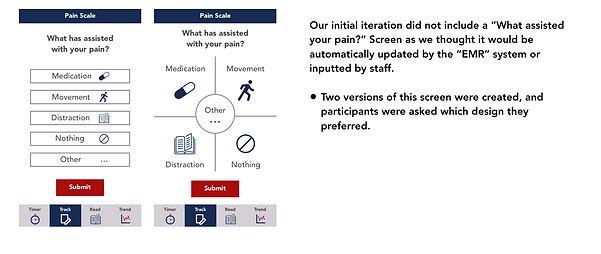
Wanted to know what impacts pain in the trend graph.
-
Numbers were also easy to denote the level of pain.
Digital prototyping & Usability Testing

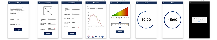
Feedback from Usability Testing
-
We tested the interactive prototype with 17 users who perfectly fit into our primary persona we created. Users found the process to be really intuitive and serves the purpose.

Final Design
-
We designed the key pages using Sketch tool and I had the ability to take conceptual ideas and turn them into functional designs.
-
I solely created the interactions of the prototype using Invision.
Summary
-
We refined the prototype after feedback from usability testing.
-
This MVP site is a mobile-first solution designed for Sydney medical community.
-
This app provides ED staff with a convenient and reliable way to record the ED patients pain level at regular intervals with reminders and store the information for medical staff to review and access.
-
Knowledge Gained: importance of client relationship, Providing Statement of work, work using agile methodology,
-
Challenges faced: Client Unavailability, Organising users, Working under the limited time frame.
Next steps
-
While we have tried to represent distraction therapy, it can be taken. Further, research shows distraction methods to be useful-games, music, deep breathing and mindfulness exercises
-
The app could be used to track pain long term via the pain trend graph at home and be used by General Practitioners and hospital staff upon presentation
-
Using the latest development in technology automatic pain detection based on automated analysis of facial expressions can be designed
MY WORK

Provide ED staff with a convenient and reliable way to record the ED patients pain level at regular intervals with reminders and store the information for medical staff to review and access.

Design a website for a driving school to help students to check availability and book classes from the site

A platform where parents can check on any updates about the child, as they are posted /logged by childcare staff !

Redesigned the website and addressed the requirements of users to revive and minimize the customer churn rate.